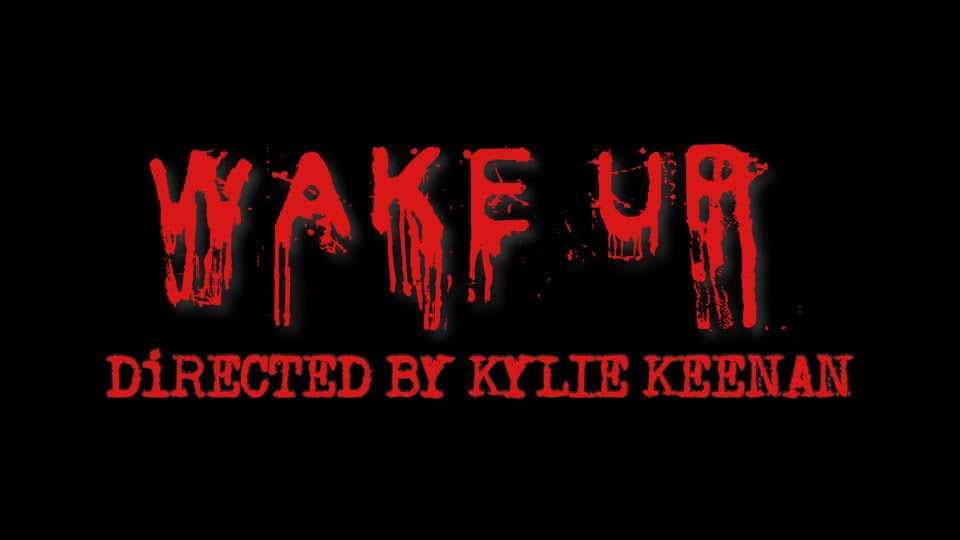
Hey y'all! Back again. Now that we have the final task filmed we can start editing! Since I edited the footage for the music video I taught my group how to do most of my techniques! Today we are going to do the title and transitions. We decided to dedicate most of the time to editing because we wanted to make the film as scary as possible. I chose to edit on my Phone because it is where I am most comfortable doing it. I again used iMovie to edit because that's where I am the most experienced in and what I did for the music video. Firstly, I trimmed the clips and scenes. This was the easiest part because it is very simple and I can apply to each scene by using just my finger. After finishing trimming I applied the transitions. This took a bit of time because I liked testing each transition and seeing what flowed smoothly. For the title, I did the green screen effect. Basically, I took the fonts and applied them to a green screen background so they would apply to the video throu...
Hey y'all! Today I am going to talk about the website: Art of the Title. This website is going to help my group and I's final task by researching some movies' opening sequences. This website will guarantee that I would be exposed to different opening sequences. This website has almost every movie you can think of. I love how there is so many movie opening sequences to watch instead of me scrambling to find one from different platforms. It is super easy just searching up a movie and the opening sequence would immediately come up. They also offer recommendations for opening sequences that are top rated. They also give you other movies when you search the movie you want that correlates with the same genre. I can't wait to start researching opening sequences with the help of Art of the Title! Bye guys!
Hey blog! Today we are starting the planning process of our Final Task! The font we chose to use are Old Typewriter and Cold Night for Alligators from the website Dafont.com. We wanted to go for a creepy vibe so we chose these two fonts because they succumbed our expectations. Old Typewriter had a very eerie look to it which went with the theme we are trying to achieve. We loved the old look to it because modern type writing fonts look too clean so we wanted more of a messy look. Our second font was Cold Night for Alligators, despite the interesting name, it had a perfect look to it. The background of the title design is black and the words are a bright red. We used a font that looks like dripping blood, hence the red color. The font size is 170 and is in all caps so it appeared to be really big on the screen. We wanted to enhance the feeling of horror and let the audience know right away that this is a horror film. The title of out film is Wake Up. We hav...


Comments
Post a Comment